Wednesday 18 December 2013

Mood board

I have gotten a few images together which i feel are appropriate of my genre for aiming to get a greater understanding of what i should be putting on and inside my magazine.

Here is my mood board:

Picture Ideas (cover)


This is one of my favorite picture ideas, this is an image which i once saw in 'Kerrang!' the band is called 'A Day To Remember' They are quite a heavy rock band but i really liked how the image looks, the scenary in the background and the way the light shines through gives a ncie effect. I feel i could easily complete this task as i could make the background something mountainous as i live in an area surrounded by mountains, I also have a few people that i know which would suit this type of style of picture and that they would suit the style and genre of my magazine which i want to create.


This is the same band but in a different environment, i feel that this picture works really well as it is quite tight together and could be easily taken. I like the editing which has been done to this, the image in the centre has been brightened to create a more pleasent look over the band, it has a dark scenary within the background which then makes them stand out even more and makes the whole image of the band more attractive. I feel i could take this picture very easily as i have the correct environment very near to me with the dark background and i have the right people i feel to recreate this image for my magazine.
Here i have an image of a mixed band, this band is named 'Paramore' they are genre specific to soft rock/punk. I think that this image looks very professional, i think this is a good image as it could be easy to recreate as it is very basic but shows the band off well so is fully effective, i like the image as it has the same genre aim as my magazine and this one seems to be effective so i feel that this could work well with my magazine. I feel that i could create this image well as i have people which would suit this type of image and i feel it would be very effective.

Second results of questionnaire (Masthead)

I gave out my questionnaire for a second time to gain a better understanding of what people would like to see the masthead of my ideal music magazine. When i give it out this time i gave it to three males and three females. This time when looking at my masthead question which this time i gave the options of 'Music melody' and 'InSync'. My results this time showed that four people prefered the masthead 'Music Melody', this was a range of both male and female with it being two female and two male, giving it a good balance of gender towards my magazine. I am aiming for a multi-aimed audience aiming at male and female so i feel that 'Music Melody' will fit my magazine better than 'InSync'.

Thursday 5 December 2013

Questionnaire draft


This is my first draft of my questionnaire, i am going to make improvements on some questions as i feel that some of the questions are not very appropriate. I will also be adding a few more questions which will give me a better idea onwhat people would like to see in a music magazine.

My finished questionnaire

This is my finished questionnaire. I have added a few more questions which are relevant to music magazines and will give me greater understanding on peoples views and doings with music magazines.


I have edited this a few times before getting this finished result, i feel that this is a fair and gives open and closed question which is effective for a questionnaire. I feel that this will give me good results to make me have a greater understanding off what people would like to see no my own music magazine.

Thursday 28 November 2013

Questionnaire results analyse

The results i have gained from my questionnaire is that the majority of people who i have interviewed were mainly into a 'Rock/indie' genre of music, It was a 30% indie and 70% rock, despite the other choices these were the only two which were chose from the people. The people of which i have interviewed was both equally male and female, i surveyed five male and five female and all were around the same age group but within the '13 - 20' age grouping from my questionnaire. This is significant as it shows what the current youth listen too, the youth is a very large audience to gain, so if i was to follow the music genre which they preferred i believe it will gain more of a following. When i was to ask my group of people whether they was to perchance any magazines, i had 40% no and i had a 60% of yes, these magazines varied from 'Q/Kerrang/Mojo' These magazines tend to have a specific genre and i believe that this also is interlinked with the genre of music of which they have said they preferred. When i was to ask whether they would prefer to buy a monthly or weekly magazine, the results i got was that people would prefer to see a weekly magazine with 70% saying this and only 30% would rather have a monthly magazine. This gives me a better option of going for a weekly magazine for my final music magazine. When i was to ask if they was active on the internet with music magazines i had 90% say yes they have looked up information in a magazine to find out information about bands and gigs etc, this shows that today the internet is a powerful tool as more people have used to internet to use magazines than buying a copy from a store. On questioning on how much people would pay for a music magazine, there was a few which varied within the answers. I had 30% say that a reasonable price for a music magazine is '£1.76 - £2.50' i then had 50% say that '£2.50 -£3.00' is a reasonable price, this got the most votes in this questionnaire so when i am going to look into developing my music magazine i am going to try and make the price range in between this total.  When asking my audience what information they would like to know about the band, i got a mix of responses. I had 30% of people say they would like to know about tour dates and information about the tours, 20% said they would like to see interviews with the band and another 10% said they would like to see question and answers with the band. The most with 40% was people would like to know about personal information about the band, this is important for people to know as if they are following a band which is giving off a bad message to its fans and treat them wrong, people deserve to know, it also will inform you of lifestyle and background whether they had quite a tough life and were brought up in a hard world and music was an escape for them. I feel that in my music magazine i am going to have to choose two of these because they are almost equal and serve the same responsibility as it is getting the band out there and showing them off in a nice way to create a larger audience. When i asked what main image they would like to see, whether it a is male band etc. I got that people would like to mainly see either a mixed band with both female and male or would like too see a full male band, they both equally had 40% towards each other so i am going to have to choose between one or the other or i could take an extra survey and find out whether the public would rather see mixed or male. When i was asking what masthead people would like to see on a new upcoming music magazine, i had an a clear favorite vote of 50% going with 'InSync' but i also had another with 30% which was 'Music Melody' I think i will run a few more questionnaires as i feel that this is close between these too and to gain a better understanding off more people will give me more reliable results.
I am going to gain a few more sets off data before i am going to fully conclude on my analyse as i feel that some things need more results as it is not clear enough whether people would want one thing or the other.

Tuesday 19 November 2013

Music magazine article (KERRANG! x2)

This is a double page spread for the music magazine 'KERRANG!'. I think that this is set out very well and looks quite attractive with the colors scheme. The colors which are mainly used are red, white and black. These colors are normally found within magazines as they are soft to the eye so are easy to read and gives an attractive look to the magazine, it also gives a setting to the page with the use of the colors too, the main use of black and white could show that it is mainly rocky and darker music. The main image is of a band which is seen to be looking quite aggressive or quite serious, they look like they seem to be quite a rock/punk type of band with the clothing and color of there hair which is often associated with that type of music. I would say that the main audience of this magazine would be pro-dominantly male as the colors, the genre which it is aiming at tends to be a more male dominated scene. The picture is often men in the main image as they tend to be the type of artists which break through in this type of music industry. The main coverline is well placed as it is easily seen by the audience and is attractive and stands out in color, the font could be changed as i feel that it is a bit plane and shows a lack of creativity. The cell lines which are in place are very well set out and the colors which have been used the white on black is very effective as it makes the writing stand out and seem important. they are set in a nice spot as it gives a nice set to the hole two page spread as it is very concentrated on the one side of the page giving it a sense of cleanliness, this is good for a magazine as it will attract more people for the look and feel of the magazine which they are purchasing. There is no sub image on this double page spread as there is no other key information which is drawn to need to show another picture of type of band/concert which they could be playing at. It tells you information about the next kerrang magazine and tells you the information can be found further within the book, this is good because it encourages the reader to keep reading to find this information and keep the purchasing if they have enjoyed what they have read.

What music magazine i would like to produce.

The type of music magazine which i think i am going to be aiming for at the end of this year is going to be based around a type of soft rock and indie genre, this is the type of genre which i mainly listen to so i feel i will be able to relate to stuff which i see from magazines i have read and interpreter them and see if i can create ways to make it work with me. I feel this is a good choice because i have got a few ideas for a main image and sub images which i can produce with a band which is very fit for this type of music and they have the correct type of look for it too, so i feel that this would be the best option for me as i have seen effective ways within magazines and not very effective ways, so i will have a better understanding already about these type of magazines. I am going to try make my front cover of my magazine have a 'NME' style to it as i feel that this is the most attractive front cover to me and suits my style of workings better, the contents page i feel would look nice with a styling of 'Q' as this is very formal and keeps everything simple and in a nice fashion and is very understandably and attractive. As for the double page spread I am going to go for a look of 'KERRANG!' i as feel this double page spread tends to look more attractive within the magazine in KERRANG!, this is because it is very orderly and tends to reach out to the target audience well which would make the magazine look better overall.

Music magazine article (Q)

This is a single page article from 'Q' magazine, This article is a little basic but is simply read and has a clean layout so is nice overall. The main image is of what is a band and they seem to be standing looking quite aggressive almost trying to intimidate, the use of there clothing such as leather coats, glasses shows of a sense of quite rocky presence as if they are hiding there identity with the glasses but showing they mean business when it comes down to it with the coats.you can see also from the peoples hairstyles that they would not be an everyday typical pop band as they do not looked dress or represented that way, they seem to be quite punk/rock orientated. The main cover line of this is showing the band off and trying to gain the band some publicity, this is an effective way of getting your name around as it shows you off for all that you are and what you show as a band. There is a masthead which is very basic showing off the magazines name and says 'Now' this could show that this band is doing well and they are in at the moment and this is the most important news, is what the people want to know off and what is happening with them. There is no sub image on this page. I like the layout of the cells on this page as it may be very basic it is also easy to understand, people could find this attractive as it looks very clean, meaning people may find that it looks more mature so will have better content to it. The colors which are used in this article seem to be red, white and black. These colors seem to feature within most music magazines and seem to attract a better audience as it is attractive and gives of a nice look to the page, it is soft to the eye so it doesn't stand out to much and is a nice shade so is easy to read. 

Music magazine article (KERRANG!)

This two page spread article from 'KERRANG!' is set out very well and has aimed at its main target audience well. This magazine is to mainly attracted males and some females and an age range from around 15 - 40 year old.  The magazine is mainly aimed at rockers and if you are into a more punk/rock scene then you would be attracted to this by what looks like a heavy type of band being shown within the main image, you can see the colors of the page are mainly dark like within the two page spread the background color stays as black and the writing is either red of white, this is good because i feel that the words are standing out on the page and makes it look more appealing to the audience itself. There is three sub images of what looks like band members together in one of the images maybe running through ideas for music as you can see what seems to be a layout of a studio and them working together to think of new and creative ideas, the other is what looks to be the main singer showing off his vocals and this could show a sense of hes independent and that he is the only main singer. The last image is a man who is playing the guitar and this could show that they are mainly influenced there music by guitar based backing tracks. I think that the way they have layered out the page is very good as they have made it clear and simple what you are to be looking at, it is not all thrown randomly around the page, seems very neat and easy to read. There is a way of contacting the website for any other news in the top hand corner which is key because it is another way for the magazine to interact with the magazine and find ways to improve or what people want to see inside. The main cells are closed together to show each are important and could be interlinked with each other and with the band which is being shown. The cover-line for this stands out well from the page and makes you want to read on as it is bright, powerful and looks interesting. 


Wednesday 13 November 2013

Music magazine analysis cover (KERRANG)

This magazine is first got a main image of 'Biffy clyro' and who seem to be may be who perform with him. the attitude of this picture seems to be dominant with the way he is almost staring out at you. He is male and seems to be quite scruffy creating a look on a music magazine of quite a rocky theme and a reckless attitude to what he does. This could also show that the aim of this is sent towards a more reckless age group of from teenagers to around the age of thirty five  The pug is in the left hand corner which is may be attracting people towards the cover as it is giving a preview of the band in the main image by giving you three of there songs to listen to for free. There is three sub images for what seems to be the band '30 Seconds To Mars' this could be added on as they could be producing good music or may have payed for this to create a wider fan base as they know that this is a well known magazine and this can create publicity for them and make and increase in records/gig sales. The last picture is what seems to be the front cover of a CD case which could signal a new realize of an album and it is a good way to gain a better response from people as they will see that its out and may cause a rise in the sales of the album. The masthead is also overlaps with the name of the magazine which is called 'KERRANG!' this could show that it is a powerful cover with the bold and capitalized text giving of that its more of a strong music genre. The colors of this magazine seem to be mainly dark only going into the colors black, white and red. these colors all seem to signal towards more of a manly base aspects which could show that this magazine is mainly aimed at men. 


Music magazine analysis contents page (KERRANG)

This contents page is one from 'KERRANG' magazine, this is set out very well giving off the page in two different sections, the top half is the main image with the masthead and the bottom is used for information about the magazine and what will be inside. the colors which have been used for this magazine is mainly black, white and yellow, the main use of black seems to give off that this magazine is mainly a rock genre and that it is going to be more powerful and dark music. the main image which can be seen is a man playing the guitar with his band mates, this could be a way for them to get some publicity for there band and maybe grow there fan base. the main masthead is only telling you the number issue of the edition which could be key for collector items and could mean that more people want to get it for the sale value in the future. in the bottom section is has an entire section of different parts which are going to be within this magazine, for example it is giving of a small title and saying what pages these can be found on, it says that there is 'feedback, news and features' these all show that they are finding new ways for people to get in contact with them and to help them improve there overall design on the pages with the feedback and how to improve what they are doing with the magazine, this is set out well as it shows you an easy way to get to separate pages and to what interests them the most about the magazines. there are a few sub images, there is one of a man in a chair which seems to be very reckless almost as if he doesn't care for rules which gives off the main genre of what rock music is about. in the bottom right hand corner is a pug which is giving away a reduced price on the magazines editions if you are to pay for a separate time length then you will be getting a profit to yourself which could interest more people as they feel they are gaining money and still getting the magazine at a different price.

Music magazine analysis contents page (Q)

 This is a contents page of the magazine 'Q' this magazine is set out very well, the layout shows off the main things which are going to be shown through the magazine and highlights them and gives you easy access to find the pages of these. down the left hand side of the page it tells you important things through this magazine and tells you the pages for easy access to them and to information which people might want to read. this also links to the main image as one of the points which have been plotted on the page links to the band which is being shown in the main image telling them about what has happened in a small brief cell. this shows that what they have said is maybe very important and key to the success of what they are doing or could link to something they have done wrong. The masthead of this page tells you the information about the phone number etc. and how to contact them , this could be for reviews of the magazine and to ask for ways to improve of maybe for competitions which people want to enter which they have seen within the magazine, in the bottom right hand corner of the page there is a sub image which has also been linked to some of the page numbers which were on the left, all the images on this page have been about men which could symbolize that the main audience of this magazine is male orientated. the colors have been used very well in this content page as it has gone for quite soft colours with little bits of black to show off important things hand make them stand out from the rest.

music magazine analysis contents page (NME)

You can see from this music magazine of 'NME' that it is set out a good content page of the magazine giving it an easy layout to understand. The colors which are apparent are mainly black, red and white. These colors seem to give of quite a powerful maybe rocky genre of the magazine and could show of that it is mainly aimed at the male production as it seems stronger and more male orientated with the way that the text speaks. the main image of this page is a hall which is going to be used for a gig and this could be a way to get more publicity for there band and could create more of a crowd for them. the layout of this is set out very well. you can see down the right hand side of the page shows what is going to be within this edition as it tells you the news, reviews, live things going on and extra features available inside. there is a pug on the bottom of the page giving them a discount on the magazine for any other copy's which could interests people as they could be saving money in the long run of the magazines life. Down the left hand side of the page is an list of what bands are going to be in the magazine telling you which page they are on, this is important as people may have to be looking quickly for a separate band and now they can easily find it so that is a good way of keeping people happy. The masthead of the page is giving you a brief description of what is going to be within this edition of the magazine which is good because it will keep people on a set location and know what to expect when reading through the magazine.

Music magazine analysis cover (NME x2)

This cover of 'NME' has a main image of a man stood smoking in quite an eerie atmosphere, the image has been put into black and white to help create this effect of the reader, could signalizing that this magazine is more of a dark and depressing nature and is going to take you on a journey into someone else's shoes. The main colors which you can seen on this cover are red, black and white. These all create a different effect on the onlooker of the magazine, the colors help create the mood of it being quite dark but the lightness of the white also shows that there could be a sign on light and things will be okay. There is one sub image on this page and that is of what seems to be a type of script which maybe has the writing or songs of a band or the person from the main image, this is then followed by some text saying 'interviews with the band' this shows that the image is giving off a look on a band is showing us that they are trying to get themselves known within this type of genre which they have been given off on the cover. The masthead of this magazine is showing off that this is a special type of magazine as it is a 'Anniversary special' this implies that this type of magazine has been a long running thing and has been very successful with it and the way that it looks. I quite like the layout of this magazine as it is easily understandable and makes the key parts of the cover stand out like the main images and the main sell lines. 

music magazine cover analysis (NME)

This cover from 'NME' magazine has what looks to be as there main image a band called 'The Wombats' they seem to give off the impression of a very funky and enjoyable type of music as you can see from there poses within the picture it seems fun and quite different which could come across as good for other types of music listeners, you could say this type of music can be portrayed as quite indie at a first glance. The masthead sis giving out information about a festival which is yet to come out and it is giving some of the headliners and saying that there are fan reactions to who has is going to be playing, this is good because it could give you an interest to of what people think of who is going to be there and how others see it. There are two sub images, the first is of an image of a man who as i have found out died and they have done a special page on him inside and to show this off to may be some of his fans they have put it on the front cover to show there respect for him and what he may have done for the music industry. The other is of a new band who have came out and it seems that it is there first interview for a big music magazine. they seem to be in quite an ordally fashion as they are stood all together as a group may be showing there closeness as a group and that they feel strong together.The colors which you can see are quite light on the eye as you can see a yellow, red, blue and white has been used, these colors are soft and pleasing to the eye.

Wednesday 16 October 2013

School Cover


This is my final draft of my front cover of my school magazine, i have chose to stick with my first layout of my first draft and to have the same ideas with pictures having the same look and design as i did on the paper. The only thing which i have changed is that i have not got a kid in school uniform on my front cover as i felt that the pictures which i had taken was not fit for my cover well and the one which i took looked more professional and gave it a cleener look to it.

This is my main image, I have chosen a picture of a six form within the school, i had origonally chosen to have a school child for my front cover but i felt that the image of the six form gave a more professional look as he is in a quite laid back clothing. I have added a few effects on this picture, I have chosen to get rid of the background and i have added a slight brightening and contrast which then gave a nicer look on his face and made it stand out more and give an appealing look to the eye.

This is my sub image of the school which i have added to show off the new look on the school with the lifts which have been added, i feel this shows a good view of the lifts and gives you an impression of how it will look if added anywhere else around the school.


Tuesday 1 October 2013

First draft on my school magazine

First draft on my school magazine.
This is my full design of my school magazine, I have set it out this way because I thought it was very pleasing to the eye and is a easy format for people to understand and get information off quickly. I have used five cells on my front cover all covering different aspects of what would be inside, along side one of my cells I have a subliminal image to support this cell and give more information about what is inside. I have a main imagine, a header, one pug, a foot line, a masthead giving you the name of the magazine, a label.

The main image which I have chosen is a school child with a next type of uniform which has been issues, it shows a shoulder view of him showing the new shirt and jumper. This gives off a nice look of the uniform and could have students and parents interested about the new uniform and how it is effecting the look of their kid and how he looks whether he is looking sharp or quite scruffy.

for my masthead for my magazine is named KHSLarge, the reasoning for this is that it stands out quite well, I have made the writing quite bold so that it stands out from the other text and looks pleasing to the eye which could draw attention and profit to it if it was going to be sold. 

this is my subsidary image, i have chosen to have an image of the front of a school showing off new renervasions which have been made to the front, i have done the picture this size to show its important to the magazine. i have put it quite high on the magazine because it might give of interests when people look at the front cover and see a new uptech school.

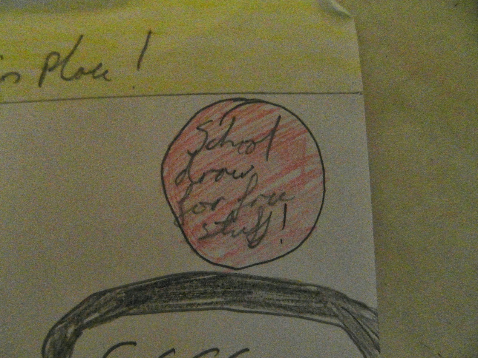
I have got a pug to interests more people towards the magazine as its shows a give away and it will be free to enter and could give your magazine more publicity. 

Here I have a cell which helps the main image talking about the look of the new uniform and gives you direction to where you want to go for extra information on this matter. I have put a red outline on this cell as it gives it a bit of a more importance as it stands out so makes you want to read it and gives off a good image to the reader

my foot line, i have chosen this because i feel it gives a good insight of what will be on the inside of the magazine and shows what kind of things will be inside. I have chosen this set up as it gives a more professional approach to the page and sets out a nice and good looking cover. I have used the color yellow as it stands out well so could bring encourage more people to read/look at the magazine. 

This is my headline which shows a brief show of what you can expect on the inside. I have set it up to stand out from the main cells and images down the center of the page as it is a bright color and will stand out to the eye.

this is another cell which gives you an insight of what stories you may find within the inside, I have chosen to style it around the top of the image as it is quite an important matter so would be seen easily and would catch the viewers eye more than the others as its one of the first you will look at.

This is a label which shows that the magazine would have been priced and I have chosen to put this on as it shows a sense of professionalism.